In the last years, web production & design dramatically evolved from the search for stylised interfaces to the search for usable interfaces. Developing a product for the web is now and before all combining utility, and usability, both in the interest of the end-user. As a result, acclaimed apps in the world of UI & UX designers are often the ones which combine the most efficient & simple design to the most direct & simple user outcome.
Product Development has never been so strategic. Looking for the best usability, the usual design process now gives a huge importance to the user: what he expects to do with the service (the problem he expects to solve), and how he is supposed to achieve it (what actions he should be able to perform).
However, the truth is: despite all efforts you invest in this user-centric approach, despite the best product moves that you can do, softwares and products usage will always be limited, by the nature of the people that will use them, and their implied variousness.
Bloody Humans.

citation by French Philosopher Jean-Paul Sartre
Your User is a person.
Most probably, a free person, responsible of its acts, with its own free will. And with skills, forces, but also weaknesses and defaults. Each one, unique and very different from each other.
Which makes very unlikely the fact that your user will act like you expect him to.
Quite not true though.
Because with the years, good practices in design and experience appeared, and still evolve in time. They streamlined the way we consume the services online. Web & mobile users adopted codes, and developed habits.
UI designers are able to create or reproduce visual environments that look familiar.
This will bring you to quickly reach decent levels, let’s say a vast majority, of users acting the same way, and able to perform what you expect them to do. Nevertheless, this count also gives us a minor part of the users that will regularly not act as expected.
This is why you may miss a point when introspecting your own product.
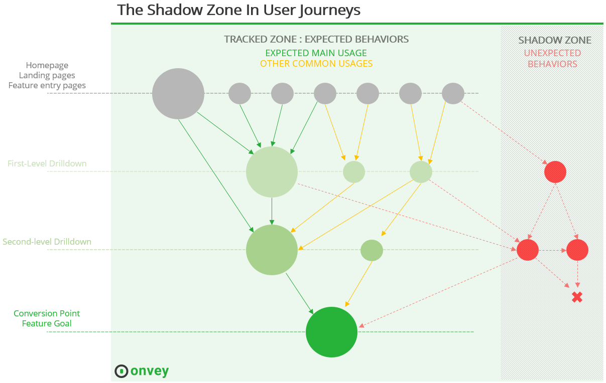
The Shadow Zone In Your Product
You can build the best features to solve a problem, that beat all the competition in term of effectiveness, ease and time of use …
With the most streamlined experience …
You can optimize the usage of your features like you do with conversion funnels, adopt a rich analytics strategy with the right usage KPIs to ensure that your product delights most of its users …
You still miss to consider a crucial part of the user base : the part of unexpected usage.
This inevitable, unshakable, uncontrollable part of the people that will never act like you expect them to:

That you want it or not, some users will enter this shadow zone.
What defines the shadow zone:
-
It is outside of any of your conversion / activity / feature funnels
-
Users which are in this zone may -or not really- be experiencing difficulties with the product. But it this case, it can generate frustration and damage their user experience.
-
Product owners have few ways to detect these unexpected behaviors, and sometimes neglect to address them.
Generally speaking, it is the part outside your radar.
Measuring users’ behavior is measuring all the different behaviors, not only the ones you expect.
Shadow Zone. Not No-Go Zone.
This shadow zone of unexpected behaviors is hard to conceive, which makes it difficult to investigate in. There is a challenge in the fact of tracking unexpected / out-of-scope behaviors. What to expect ? How to differentiate isolated weird behaviors from common problems that several users meet?
But that it is hard to reach does not mean it does not exist, neither that you should ignore it.
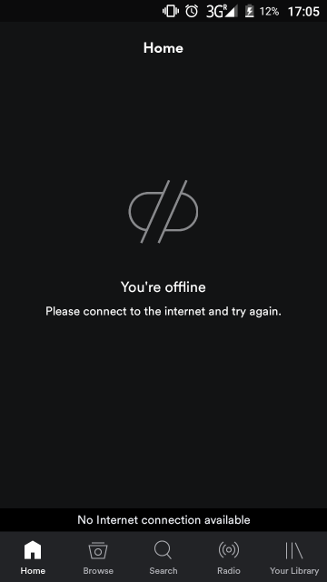
Web product owners, be happy, it could even be worse. At least you don’t have to track behaviors offline like mobile apps sometimes must. Here is a double example of a “deep” shadow zone which features an annoying / poor experience for the user:
Ever tried to launch Spotify app while disconnected from the data network?
Well, here is what happens:

Not what I call a warm welcome.
Fine. I am offline. And also there is no internet connection available. Oh wait. It’s the same. Anyway, thank you for letting me know. Now, let’s press the small “library” button so I can get to my music, then “playlists”, then — oh nice, music.
Quite boring, this intermediary step. What is his purpose? Spotify has good reasons to want people connected. Usage tracking, personalization of the recommendations and playlists, artists promotion, …
This specific behavior sucks, and it is out of their scope, in the shadow zone, for 2 simple reasons:
-
At this moment, the user is not looking for music, nor listening for music, nor socializing around music .. he’s outside any funnel they drew, just trying to get to the next interface where he could finally access his music. This is the part that could easily be fixed with proper analytics on the shadow zone.
-
But here, the user is .. disconnected, which means that Spotify may eventually do not track any activity for the user at this moment – analytics providers do not all make this possible.
What Spotify misses here :
-
I want music.
-
I have music synchronised on my phone.
-
The data network is turned because I travel abroad.
-
I tapped on “library” immediately everytime after I had this screen (the part you can understand and fix with proper usage tracking)
-
It’s a marginal case – but among 40 millions users, I am probably not alone (the problematic / questioning behaviors that are common are those you must focus on).
-
It’s an annoying one – and no one wants to annoy its customers.
-
They could draw direct routes to my music anyway – this bloody screen is empty !
This example gets in count in damaging my experience while using the app, making it a pain to launch it, and brings me to look into alternatives. Offline or not does not make me more indulgent.
Don’t Be Afraid Of The Darkness
When building your product, once you defined the goals for each feature – potentially based on your user stories, you will want to check that you did your job properly, by analysing proper usage KPIs. But this is only the first step.
Once everything runs well, and once you have satisfying levels of usage for the largest part of the user base, it is interesting to look into this part of darkness which is the shadow zone.
For this, you must work on detecting what are the existing and actual unexpected usages that are made of your product, and that you did not planned.
Paying attention to these behaviors through specific usage KPIs allows you to understand real usability & user dispersion problems that you could not anticipate. And bring lost sheeps to the right path, delivering better experience and building better satisfaction.
It is not about fixing any individual problem. Some people may just be unable to use your product properly, because for instance, they miss some requested skills. The goal of this operation is to detect, among the different use cases that appear, which ones are sufficiently common and that have actually an impact on your conversion, retention, or on the user experience, in order to fix them.
Don’t draw a rule from every single example, but find the meaningful examples that are actually common behaviors that you did not expect.
The better your designer is, the most straightforward and non-dispersive the experience and journey in your product will be, and smaller the shadow zone will be too.
Once you are done optimizing your conversion and usage funnels (of expected behaviors), jump into usage tracking about the shadow zone. As reduced as this part can be, you can find a benefit in fixing problems that just a few number of users will face, but which turn out to be huge ones. Find where are the unexpected and out-of-scope common behaviors, and address them one by one.
Work on the unexpected behaviors to bring them back in your strategy.
Also, you must accept that there is an incompressible part of shadow in your user base. You will never be able to bring the light everywhere, because humans are not machines, you could never anticipate 100% of their moves. Define, according to your product priorities, what is the acceptable part of the experience you accept to do not have control on.
PS: We develop a completely new analytics platform for product people, that provides insights on the usage made of your online application or website. It’s called Onbrowse and you can register for free beta now.

 Psychology of Choice applied to Web & App Design: Convince Clients!
 The Buyer Journey: Nothing More Than a Series of Questions To Answer
 A Simple UX Process To Deliver And Maintain Better UX